Beautiful post about friendship and nostalgia.
Project 9: Portfolio
- Portfolio (Scribd.com):
- Project Corrections / Time spent: I spent 20 minutes correcting my brochure. I lightened the background and changed the size of the body copy to 10 instead of 9. I also moved the door further from the star. Although I was happy with the brochure, I like the lighter backdrop better so I can read all the words with ease. I spent 20 minutes correcting my flier. I changed the font size of “Lincoln Convention Center” in the middle box. I also changed the word “leadership” at the top to a new font. I did this so the flow would be better and less busy. I took 1 hour correcting my montage. I made the picture of Sylvester Stallone more transparent. I moved the font down for white space and added an outer glow to the text to make it pop more. I also moved the text down so it wasn’t on Rocky’s face. It made it way easier to read as well. Then I spent 30 minutes redoing the event ad. I made it cleaner, and chose one theme rather than two. I tried to unify it. I made it more simple and easy to read by changing the body copy and the event information layout.
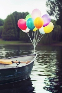
- Message: Showing my work off in a professional layout with a description next to it. I wanted to show my personality, so, like my blog, I used balloons as the recurring theme.
- Audience: Potential employers and website viewers
- Top Thing Learned: I honestly learned the importance of saving everything in a correct and sensible order on my laptop. Everything was spread across different computers and files, which made it hard to organize everything. Never again will I be that scattered when doing projects!
- Future application of Visual Media: I want to do this for a living, so it will be applicable everyday. The next big thing coming up for me that I could apply visual media to will be my graduation announcements!
- Color scheme and color names: Big Split Complementary
- Title Font Name & Category: KG Strawberry Limeade, Handwriting
- Copy Font Name & Category: Times New Roman, Slab Serif
- Thumbnails of Images used:
- Sources (Links to images on original websites / with title of site):
Project 8: Brochure
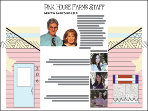
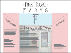
Description: A 2 sided folding brochure that was full bleed.
Process (Programs, Tools, Skills): My process was extremely complicated! I used all three programs: Adobe Photoshop, InDesign and Illustrator. I created the template in InDesign. That took a long time because I was doing a trifold and I couldn’t figure out how to get them to match up. It was also hard to recreate my house on the fold on front! In Photoshop I was able to create a clipping mask so that the curtains on the window looked like lace. That was an incredible process and really cool when done. I used Illustrator to create the star on the front of the house and on the title as well.
The text going along the wave took a very long time to figure out, and lots of tutorials! This project helped me see how to synthesize each program and really tested my knowledge of the programs as well.
Message:Inform my audience about Pink House Farms, and introduce the sponsor Petals and Pearls.
Audience:Antiquers, Families and Retired Couples
Top Thing Learned:Really, the top thing learned was tutorials are the best. And the most helpful! I was grateful for YouTube and my roommate Sarah during this project. She helped me so much and was by my side the whole time. I also learned how to rely on rulers. I didn’t use them much before, but it was key this time.
Color scheme and color names:Split Complimentary, Pinks, Blues, Oranges, Whites
Title Font Name & Category:AlwaysHere, Slab Serif
Copy Font Name & Category:OptimusPrincepus, Slab Serif
Word Count of copy: 375 words
Thumbnails of Images used: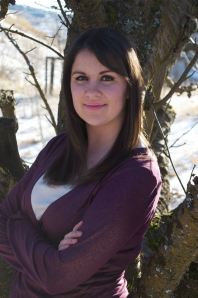
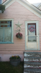
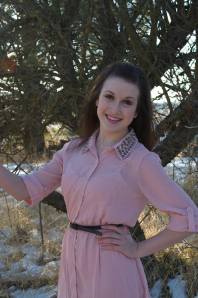
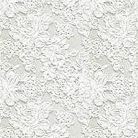
Sources (Links to images on original websites): http://www.dharmathai.com/?attachment_id=45
Don’t forget to include your video presentation: THIS WILL BE UPLOADED ON MONDAY! 🙂
Project 6: Stationary and Business Cards
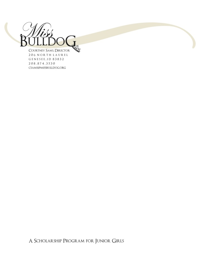
- Description: Loved this project. It was to use Adobe Illustrator and Adobe InDesign to create a business card and stationary for a business of choice! My business is a scholarship program for my hometown school, the Genesee Bulldogs.
- Process (Programs, Tools, Skills): I used Adobe Illustrator for all of my project. I started with making the new logo. I knew it had to be very simple and have a statement piece. I love the fonts I found for the logo! The crown is also an original. (I’m pretty proud because I have never done anything like that before!) It took a very long time to create the crown with the pen tool and the curved line tool. I liked that the crown is hanging off the “G” in “bulldog” because it adds interest, and I can use that crown as a statement logo: like the Nike Swish or the Target.
When making my stationary, I just used a keyboard symbol for the gold swerve at the top: (Shortcut on Mac is Option+B) that gives you the ∫ symbol. I then rotated it sideways and voila! Simple but effective. Love that! I then used clipping masks on the business cards, both front and back so the crown and swerve went off the page.
- Message: Junior girls need scholarships. The Genesee Bulldogs of Genesee Joint School District #282 are providing that opportunity through the Miss Bulldog Scholarship Program.
- Audience: Junior Girls and their parents
- Top Thing Learned: How to make a clipping mask for a business card.
- Color scheme and color names: Monochromatic: Gold + Black and White
- Title Font Name & Category: Optimus Princepus: Slab Serif, Edwardian Script ITC: Script
- Copy Font Name & Category: Optimus Princepus: Slab Serif
Project 5: Logos
- Description: This project was to use Adobe Illustrator to make three different logos. I absolutely loved this project! I would’ve kept designing, but the deadline came. I loved all the tools I can use in Illustrator. It would take too long to list them all, but they are fantastic.
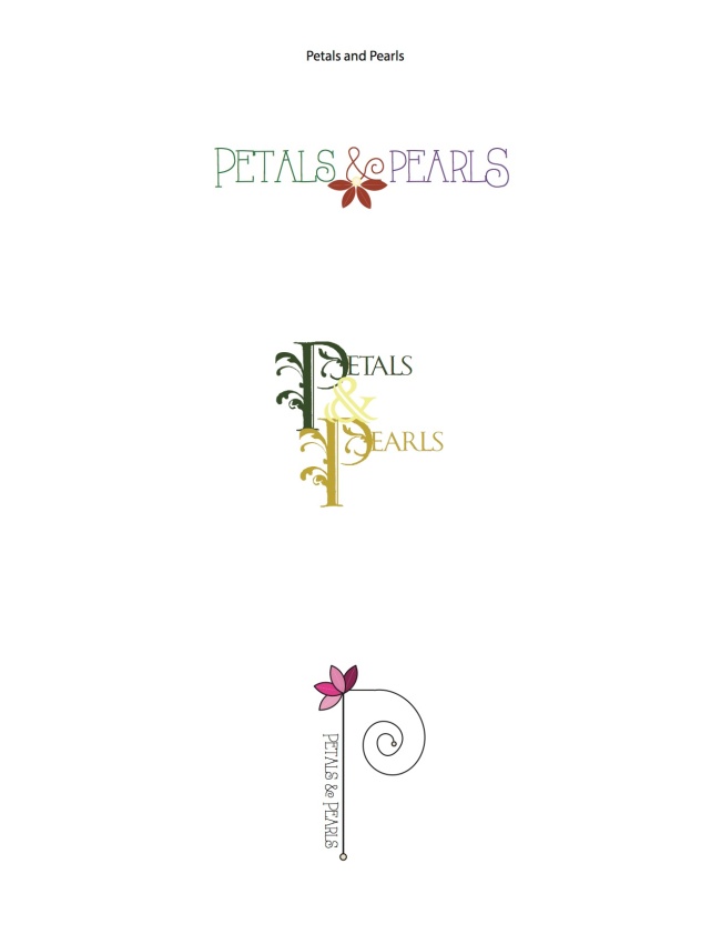
- Process (Programs, Tools, Skills): My business, Petals & Pearls, is actually an Etsy business I am trying to start. They are flowers made of cardboard and strung with pearls. I have three different looks: the first is just simple with a flower, and the center resembling a pearl. The second is more of a Victorian type logo with an early 1900’s color scheme. The last is one I envisioned for envelopes or tags on an actual product. The process was typing out the font, then trying tons of different colors to see what felt right. I liked playing with the shape tools to get the exact pearl and petal shapes. The spiral on the “P” on logo three was difficult. I still would like to tighten it a bit. The process was fun, but far from over! 🙂
- Message: Petals & Pearls, a Company which sells recycled flowers with a touch of class in the string of pearls hanger.
- Audience: Definitely people who like country chic: people in the Pacific Northwest love them!
- Top Thing Learned: Colors and shapes in illustrator! But I also learned a lot about how to change text, which is a very helpful tool to have under my belt.
- Three Color Scheme and Color Names: First logo: Split Complementary: Violet, Brick, Lime
Second logo: Analogous: Yellow, Lime, Green
Third logo: Monochromatic: Red (mostly pink tones)
- Three sets of Title / Body Font Names & Categories: First logo font: Always Here (Decorative)
Second logo font: Caribbean Tool (Slab Serif)
Third logo font: Always Here (Decorative), and the “P” is just shapes
- Votes on favorite logo: Logo Three won! Logo One came in a close second and logo three got the least.
Logo 1: 4 votes
Logo 2: 1 vote
Logo 3: 5 votes
- My favorite logo is ___Logo 3____.
Project 4: Montage
- Description: The project was to take at least two photos and combine them into one photo. I loved this project! It was my chance to really work with ROCKY for a point!
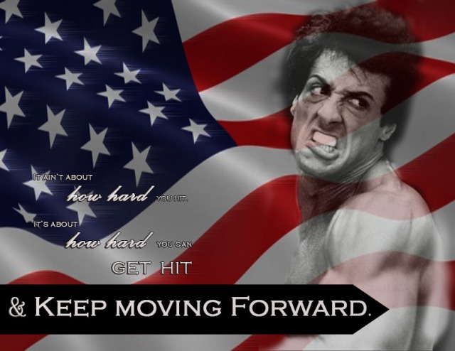
- Process (Programs, Tools, Skills, Steps taken while designing): This project really stretched my abilities. I chose the flag picture because it fits really well with the whole ROCKY theme. I then added a filter onto my flag that makes the stars look like they are moving, which fit really well with my quote about moving forward. I also originally had my font really large, and after the draft critique I shrunk it down a lot. I like the flow more now that the font isn’t so distracting and crowded. I also flipped the picture of Sylvester Stallone as Rocky so that after reading the quote, and follwing the black arrow across the page to him, his eyes would keep you moving forward as well.
- Message: The message is really the quote: “It ain’t about how hard you hit. It’s about how hard you can get hit and keep moving forward.” This is from the ROCKY series and it inspires me.
- Audience: My audience is anyone looking to be inspired.
- Top Thing Learned: How to gradually blend pictures together.
- Filter / Colorization used and where it was applied: Wind filter, applied to the stars and stripes on the flag.
- Color scheme and color names: Americana: Red, White, and Blue (black and white as well)
- Fonts Used: Palace Script MT–> Script / Copperplate Gothic Light–> Slab Serif
- Thumbnails of Images used:
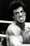

- Sources (Links to images on original websites / with title of site):
ROCKY PICTURE: Stirile Pro TV: http://protv.md/stiri/divertisment/stallone-actorul-care-a-invins-saracia-si-a-inspirat-o-natiune.html
FLAG: Hollywood Journal: http://hollywoodjournal.com/soul-dilemma/hollywood-mccarthyism-2012/20130125/
Project 3: Photodesign
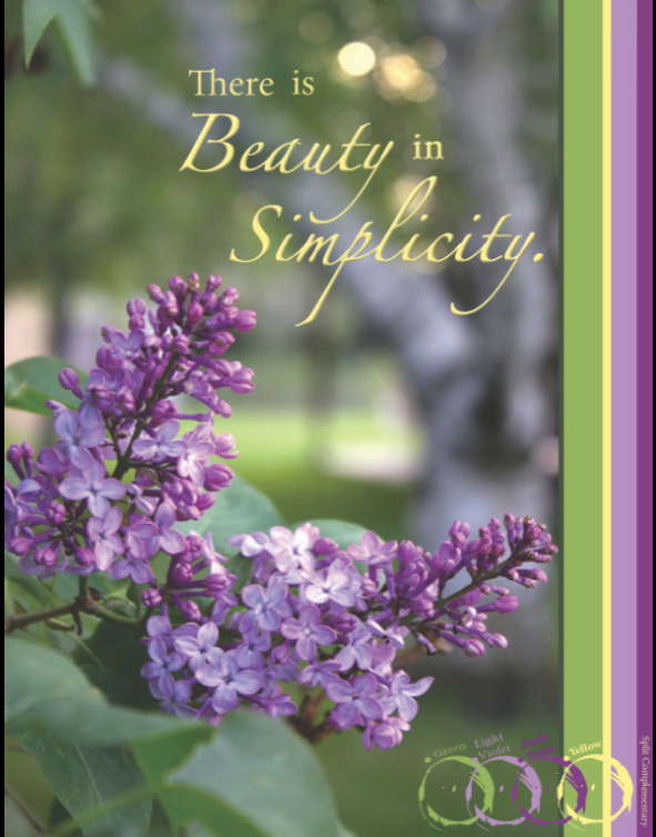
- Description: I loved this project. It was really time consuming, but taking my own photo for a little inspirational poster was fun! The color scheme was fun to plan out and I love how it came together. When uploading the original image, the colors weren’t right, so the image above is a screen shot so the colors are accurate!
- Process (Programs, Tools, Skills): I used PhotoShop to design/change the photo. I first lightened the photo, and then I put it into the 8.5″x11″ design page. I picked colors out of the picture to make the rest of the poster. Picking the right colors is harder than I thought! If you pick a color that isn’t really seen, it takes away from the design. On the color stripes on the side, I tried to make the stripes representative of how much of that color was in the picture.
- Message: “There is Beauty in Simplicity.” I love lilacs because it reminds me of simple times at home, so the whole message of the poster is peaceful and simple.
- Audience: I think the audience is anyone really, but specifically will resonate feelings of peace in those who know the smell of lilac!
- Top Thing Learned: How to pick color swatches out of pictures. I also learned to SAVE, SAVE, SAVE! My program quit after three hours of working and I had to start completely over.
- Color scheme and color names: Split Complementary: Green, two shades of violet, and yellow.
- Title Font Name & Category: N/A
- Copy Font Name & Category: The words “beauty” and “simplicity”: Zapfino, Script
The words “There”, “is” and “in”: Minion Pro, Slab Serif
The names of the colors/color scheme: Minion Pro, Slab Serif
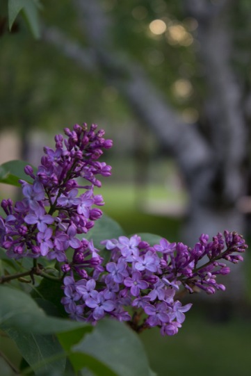
- Thumbnail of original, unedited image inserted
- Date and location you took the photo: Tuesday, May 20, 2014. Rexburg, Idaho. Kensington Manor Apartments.
P3 Activity: Photography
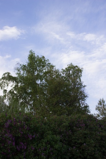
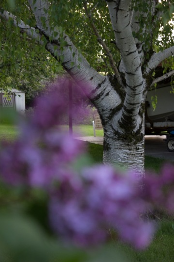
Light 1- Outside
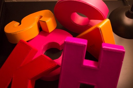
Light 2- Inside
Focus 1- Foreground
Focus 2- Background
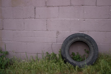
Composition 1- Rule of Thirds
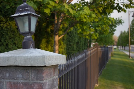
Composition 2- Lead Room
This activity was definitely a challenge. I enjoyed going around with my fantastic roommate and photo-girl Sarah Fillmore as she taught me some of the things she knew. My absolute favorite was the foreground/background pictures. It’s interesting how the same picture that simply has a different focus gives a different vibe. Taking photos at the right time of day is a skill as well (one that I wouldn’t have known about if it weren’t for Sarah!)
For the first light picture, I was glad to see some blue sky in Rexburg! There are beautiful trees behind my apartment complex, so I tried to capture both here. I am also glad that the sky wasn’t blown out white, but that the clouds are visible. I really struggled with the artificial lighting. Everything I kept doing turned out really orange. I don’t like any of the ones I took, but this was the best of the worst. I already mentioned the foreground/background pictures, but I loved those two pictures. The rule of thirds photo I adore. I really liked the old shed we found while walking, and then the tire was just there and it was so interesting, like there was a story dying to be told. As far as the rule of thirds, the grass line is on a third, and the tire falls on a third as well. The green and purples in the picture contrast really well too. The last picture was difficult, because I wasn’t exactly clear on what lead room was. But, I liked the fence surrounding my complex, so I used that plus the cool lantern on the post. I tried some pictures with a person in them, but they weren’t turning out right. Overall, I like my pictures. I think that they are interesting and different.
Project 2: Event Ad
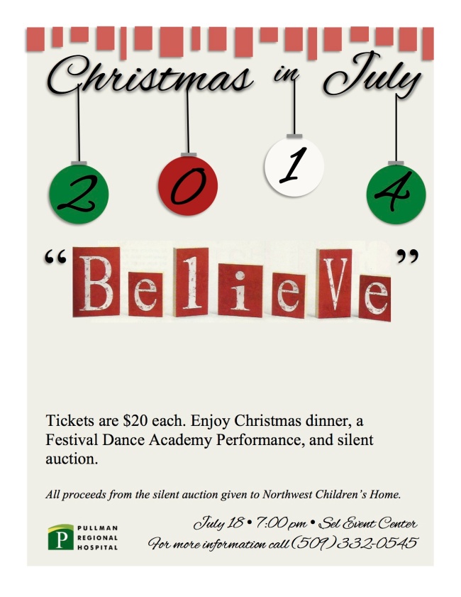
- Description: A full bleed event ad to promote an event using Microsoft Word and a scanned image.
- Process (Programs, Tools, Skills): Scanned the picture of the word “Believe” from a Country Sampler Magazine. Once scanned, I cropped the image and placed it on the page. The rest was created using Microsoft Word only. The Christmas theme was fun to play with. I love the ornaments hanging from the date. It adds interest! I also used the green ornament to tie in the green logo at the bottom. The red blocks at the top are repetitious of the “Believe” blocks.
- Message: I am raising money for the NorthWest Children’s Home via a silent auction. All ticket sales will go towards the Festival Dance performance, Dinner costs, renting costs, etc.
- Audience: My audience is people! In all seriousness, it’s for everyone. All ages; there is an activity to interest every age.
- Color scheme and color names: Complementary; (red, green, cream)
- Top Thing Learned: How to scan from magazines without the texture showing through.
- Title Font Name & Category: Alex Brush, Script
- Copy Font Name & Category: Times New Roman, Slab Serif
- Scanned images used, sources, original sizes, location of scanner used: Image scanned from Country Sampler Magazine, November 2013 Edition. Page 69. Original Size was 2″x7″. Scanner used was from my home scanner.
Project 1 Flier
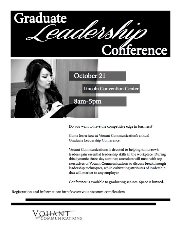
- Description: This is a black and white promotional flier to promote a leadership conference.
- Process (Programs, Tools, Skills): I first drew four sketches of layout ideas. Once completed, I used Adobe InDesign to create the actual flier. I took a draft to class and had three other people look at it, plus sent it to the Community Relations director at Pullman Regional Hospital for a professional opinion. I used off set lines/boxes for interest and repetition. I also chose to make the most important information larger than the rest. I like the balance of the picture on the left then the text on the right. The logo is small because they are just sponsoring the activity.
- Message: There is a leadership conference for recent college graduates. If they want to have a competitive edge in business they should sign up to come to the conference.
- Audience: College graduates of current year.
- Top Thing Learned: How to use basics in Adobe InDesign. How to use repetition and how to layout important information.
- Title Font Name & Category: MinionPro- Serif, Coneria Script Slanted Demo-Script
- Copy Font Name & Category: MinionPro- Serif
- Links to images used in this project:
